Well, there were some immediate problems.
Problem #1: The store usually served the smoothies in plastic cups which look terrible in photographs.
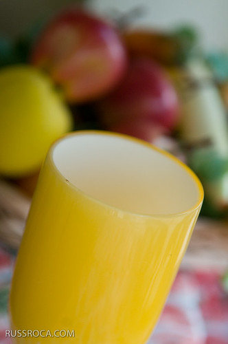
Solution: I brought some glassware with me just for this eventuality. I ended up not using what I brought but grabbed a colorful cup they had as a display in the window. Serendipity.
Problem #2: The store was small and outside of a small area where they make the juice, the space looked like a pharmacy with pill bottles on the walls.
Solution: There was only one real place to shoot. Right by the window. I moved things around so I could get to the window and set up there. I repurposed a bowl of fake fruit and a table cloth with a watermelon pattern on it and set them up so they would provide the background.
Problem #3: The drink itself wasn't very interesting looking. Purple and thick. Nice color but not enough texture.
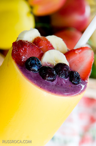
Solution: Chop up some fruits, grab a straw and assemble the perfect looking smoothie.
The next series of photos, show the progression of the image.

Testing the composition with the empty cup while the smoothie is being made.

Adding the smoothie and some fruit slices. I think the smoothie itself is getting lost.

Jenny, the reporter with me, spoons in some more smoothie so it looks like it's flowing out.

I feel that it needs another vertical element to break up all the fruit so I add a straw.

The final image. Added berries for more texture. Post to make it snap.
1 comment:
Mmmmm yum, yes - definitely frutis add this little SOMETHING that gives it tasty look :)
Post a Comment